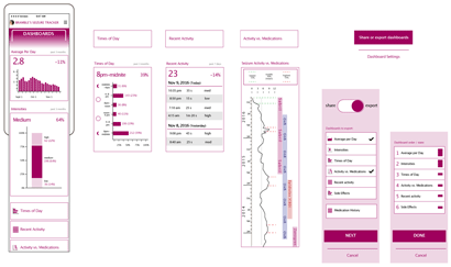
Clear, at-a-glance dashboards provide a 'snapshot' of current activity and how it is trending. Average activity per day/week, time of day distribution, and intensities distribution can be valuable to communicate to providers, teachers, and caregivers so they know what the 'baseline' is and can then react if things seem to be changing.