Jeffrey Greene
|
San Francisco, CA
status: 'Creativity, Inc.' by Ed Catmull of Pixar is an amazing and inspiring read.
INFORMATION ARCHITECTURE & INTERFACE DESIGN
thoughts on process
Measures and Metrics
IA/UX Framework
An Interface is a Conversation 
Form Follows Message 
Lizards Like Coupons 
Global Nav: First or Last? 
Architecture & Neuroscience 
MEASURES AND METRICS
One of the recent additions to my IA/UX framework is measures and metrics. It has become increasingly crucial to be able to quantify as much of a successful UX as possible, be it in terms of aggregated time saved performing repetitive tasks, or helping evaluate changes to functionality, or increased usage of an enhanced feature.

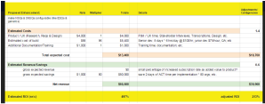
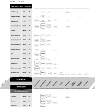
(top) A 'bubble chart' showing the usage of an application’s features by user role. This visualization shows overall usage metrics (table), comparative usage of those functionalities broken down by user role (horizontally), which features are most (and least) used (size of the 'bubbles'), and (vertically) how much ‘coverage’ each role has across the application. Such data can be used to phase out seldom-used features, streamline roles, or see if workflows are too scattered or concentrated across handoffs. (A little show/hide interactivity would makes all those functions and data a little easier to filter and digest). (bottom) Estimating ROI at the beginning of the process can help translate 'fuzzy' concepts like 'usability' into hard numbers that stakeolders understand, in order to approve and/or subsequently judge the success of a UX enhancement.
'Weapons of Math Destruction' by Cathy O'Neil and Nate Silver's 'The Signal and the Noise' are important counter-narratives to the more idealistic 'everything is quantifiable' 'hype' around big data.
AN IA/UX FRAMEWORK
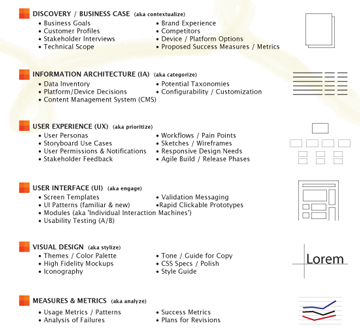
For the purposes of evaluating a proposed business application, the following outline of a User-Centered Design framework can help determine if the various IA / UX requirements have been accounted for. This framework is not, however, a strictly linear process. In practice, we consistently ‘loop back’ to iterate and revise as we test our assumptions and check in with stakeholders (internal and external). The more rigorous we are during this process, though, the less ‘arbitrary’ our design decisions will be, leading to quicker and more accurate solutions.

A 'checklist' of the areas that should be given thought and analysis in order to set the groundwork for a successful product.
The classic reference: Edward Tufte's 'The Visual Display of Quantitative Information.'
AN INTERFACE IS A CONVERSATION
I find the process of creating Information Architectures and User Experiences fascinating and challenging. I try to think of an interface as one half of a conversation, always working to trigger some response from the user. As such, I feel a project’s heart is often not solely technological in nature, but will arise from an idea or an observation drawn from the human experience. Having a strong underlying 'human strategy' not only prioritizes solid usability and user experience, but also tends to make subsequent technological development and visual design MUCH more focused and less subjective.

Strategy concepts for a revamp of CBS News. The journalistic idea of confirmed sources is brought to the forefront as a way to distinguish rumor from news, and thereby elevate them above the ratrace of the 24/7 blog newscycle.
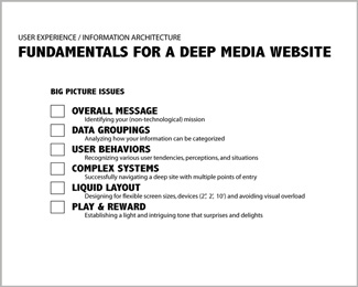
A well-defined IA/UI methodology must address a maddeningly complex range of considerations. I begin by sketching out five broad categories: brand goals, content attributes, technological scope, future scalability/portability, and user behavior. By breaking the larger problem down into a number of independent components, you can cover a lot of ground quickly, and sketch many ‘glimpses’ or fragments of solutions early on without being overwhelmed by the entirety. Such early back and forth between ideas and details is incredibly important to avoid falling into generic solutions that don’t specifically advance your goals. I'm a big believer in research and planning, as long as it stays grounded to your specific business goals, your users' needs, and the particularities of your content.
'In Pursuit of Elegance' by Matthew E. May identifies 4 'S's: Symmetry, Subraction, Seduction, and Sustainability as critical to a product or brand’s success. I'd replace Symmetry with Simplicity, but Subtraction and Seduction are spot on. Very good read.
FORM FOLLOWS MESSAGE
Design is communication. The clearer the desired message (aka affect), the greater the chance of communicating successfully. Prioritize all that information so it can be comprehended and processed. Give your best content room to work. Let it breathe. Good interface design mimics thinking, and at its best instigates and complements a set of mental and visual processes in the user’s mind. This is engagement. An interface is half a conversation. This means building in room (visually and cognitively) for your users to think and use their imaginations.

ClickStar promo 'city' for Danny DeVito's Jersey Docs channel.
Nor is design simply decoration. Good design leads the eye, prioritizes the important things and does not get in the way or distract from the task at hand. As a former visual designer, this is hard to say, but if you have a clearly-stated big-picture strategy, then the font or the border style or the shade of blue really doesn’t end up becoming such a life-or-death issue. (I put font choice number two behind religion as the cause of most conflict in the world). Visual design can greatly complement and reinforce an already well-organized layout. But design alone cannot save poor IA, and should never be asked to do so. Good IA and UI wireframes sets the stage for the visual designers to concentrate on doing what they do best. For better or worse, from the looks of Facebook, YouTube, Twitter and Google, things are very much trending towards a 'non-design' look anyway.
'Notes on the Synthesis of Form' by Christopher Alexander presents the idea of 'fit/misfit' as a feature of good design. Over decades or centuries, all 'misfit' is eventually removed, leading to designs that 'work.'
LIZARDS LIKE COUPONS
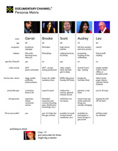
Each of us, at various times, are highly rational, embarassingly emotional, or subconsciouly primal. Sometimes we're task-oriented, sometimes we're looking for something specific, and sometimes we're just goofing around aimlessly. Content can be crafted to appeal to these various states of mind. I like using the terms ‘hunters, gatherers and wanderers’ as an initial way of identifying basic behavioral personas (which often exist within the same person). By factoring such ‘predictable irrationality' into your strategies, you can go a long way towards devising a more quantifiable recipe for giving every element on the page a specific time, place and form.

A personas matrix stressing behaviors over demographics.
At the elemental level, strive to make each module as specifically engaging and rewarding as possible. Be playful with tiny glints of feedback. Surprise and delight. Teasing the right amount of information at the right time will entice your users to click through to complete the thought. And while you’re at it- use plain language. Experimenting with the tone of the copy early on can offer great insights into the overall experience through the personality it conveys. Don’t save it for the end. Community sharing- don't let the jerks ruin it for you.
'Free' by Chris Anderson, does a good job of describing 'attention' and 'reputation' as the real 'currency' of the web. A successful venture, he says, will figure out how to convert these into dollars. The failures wrongly attempt to make those dollars directly.
GLOBAL NAV: FIRST OR LAST IN DESIGN?
There's a Detroit techno DJ/producer named Jeff Mills. I've heard that when he writes a track, the very last thing he adds is the kick drum. Now, that might seem odd, since when you think of techno and dance music, the four-on-the-floor 'boom boom boom boom' is what comes to mind. But Mills constructs his tracks so intricately that he 'implies' the downbeat with the other counter-rhythms. Then when it does come in, it just CRUSHES. I like that idea a lot, and, switching from music back to UX/UI design, you can probably guess that I similarly choose to hold off on adding a global nav until rather late in the wireframing process.

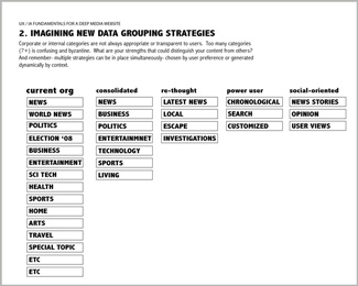
It seems the common wisdom says to block out your navigational menus first when laying out a site. I disagree. As interface designers, we sometimes think too much in terms of categories and may forget about the 'regular' user's experience, who's looking at the content, not the menus. I like to start by building self-contained 'modules' for each of the main interactions, in which I try to build as much 'contextual' navigation as I can into the content itself. I feel that provides a more local, organic flow around the site, instead of relying mostly on a separate nav bar (which is often way at the top of the site, far from where you are at the bottom of an article or form).

'Blue Potential' by Jeff Mills
Two fields I look to for inspiration are architecture and neuroscience. My own architectural training has several strong parallels to the digital constructions I now make: in strategic thinking, in managing complexity, and in creative problem-solving. I feel it’s much like architecture, just in 4 dimensions instead of three: structure, context, systems management, circulation/navigation, detail/skin, etc. In the case of information architecture (unlike, say, 'viral' marketing), the metaphor is apt.

Interface Design is Architecture in 4 dimensions.

A second field of inspiration is Neuroscience. Theories on how people learn and process information are very helpful in creating interfaces. Small-world structures, the 'comprehending 5-7 things at a time' limit, the safety net of redundancies and multiple pathways, and the non-linear ways we store and retrieve memories can provide clues to what can make one interface feel more intuitive than another. Fascinating stuff, human perception.

'Proust Was a Neuroscientist' by Jonah Lehrer
Good communication across departments up and down the food chain is so crucial. Keeping people involved and aware of the whole process- showing folks near the beginning stages or even administrators not directly involved the progress and final product that they contributed to. When I was directing the i::design tv show, we tried to have weekly screenings of the episode- sometimes as a rough cut, sometimes close to finished - for everyone- the secretary, the accountant, the assistant line producer (ten years later, 'Creativity, Inc.' by Pixar's managing partner made this same case). Sometimes seeing the rough cut showed how much work the 'post' team really did, and gave a sense of everyone's contributions counting. Pride when the assistant editor saw the photos he took show up in the segment. It totally invigorated his work for a couple of weeks. I'm a big believer that the more you know outside of your particular specialty, the better your work will be. Maybe that's because I'm so curious and love to learn new things, but I think it helps. In my business, I tried to find people who are like that as employees, and I think it creates a better working environment and a better final product. The team is only as good as its fourth best member.

One thing working in Los Angeles really taught me is the many shades of that thing called 'collaboration.' It's such a cliche in the film industry, and it's often just talk. But true collaboration requires a way of seeing your work where if only 50% of what you see in your head makes it to the final product, the idea should be strong enough to still show through. Nothing ever survives 100% through the production process. Everyone has ideas. And a good leader encourages participation. A good idea will get tempered from the heat, not fall apart.

'5 Dysfunctions of a Team' by Patrick Leccione is a very enjoyable fable illustrating the benefits of free, back-and-forth communication among departments.